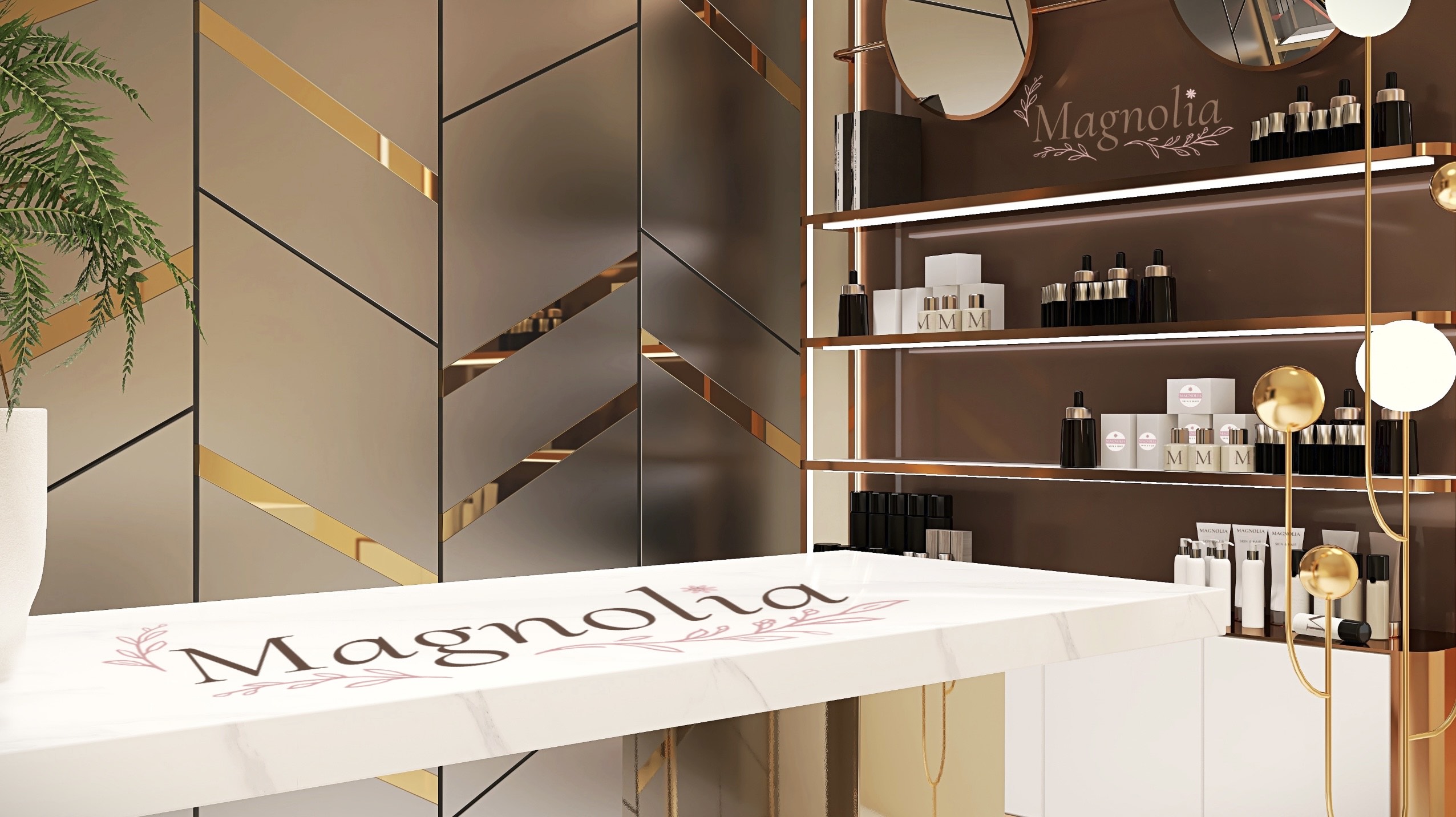
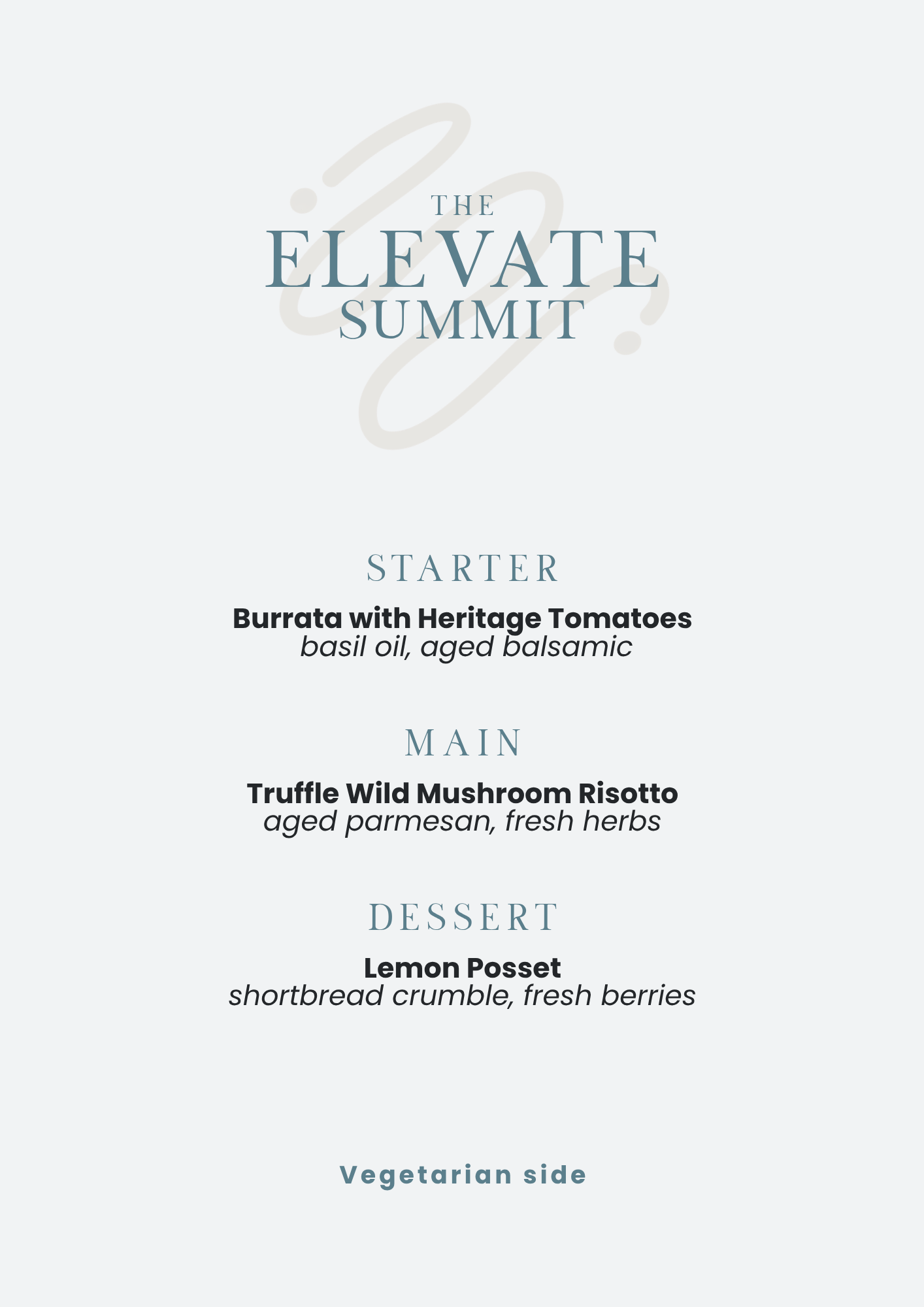
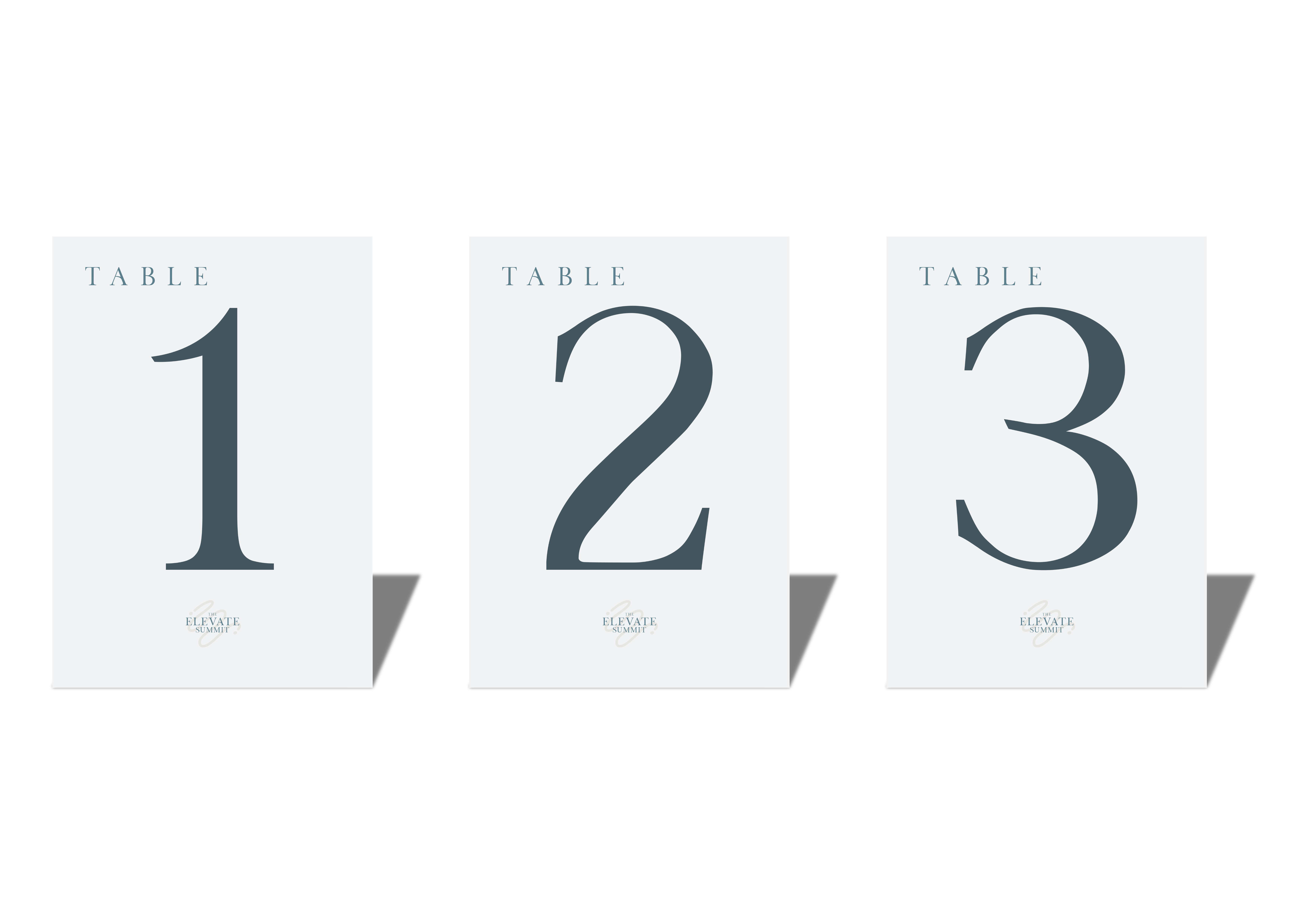
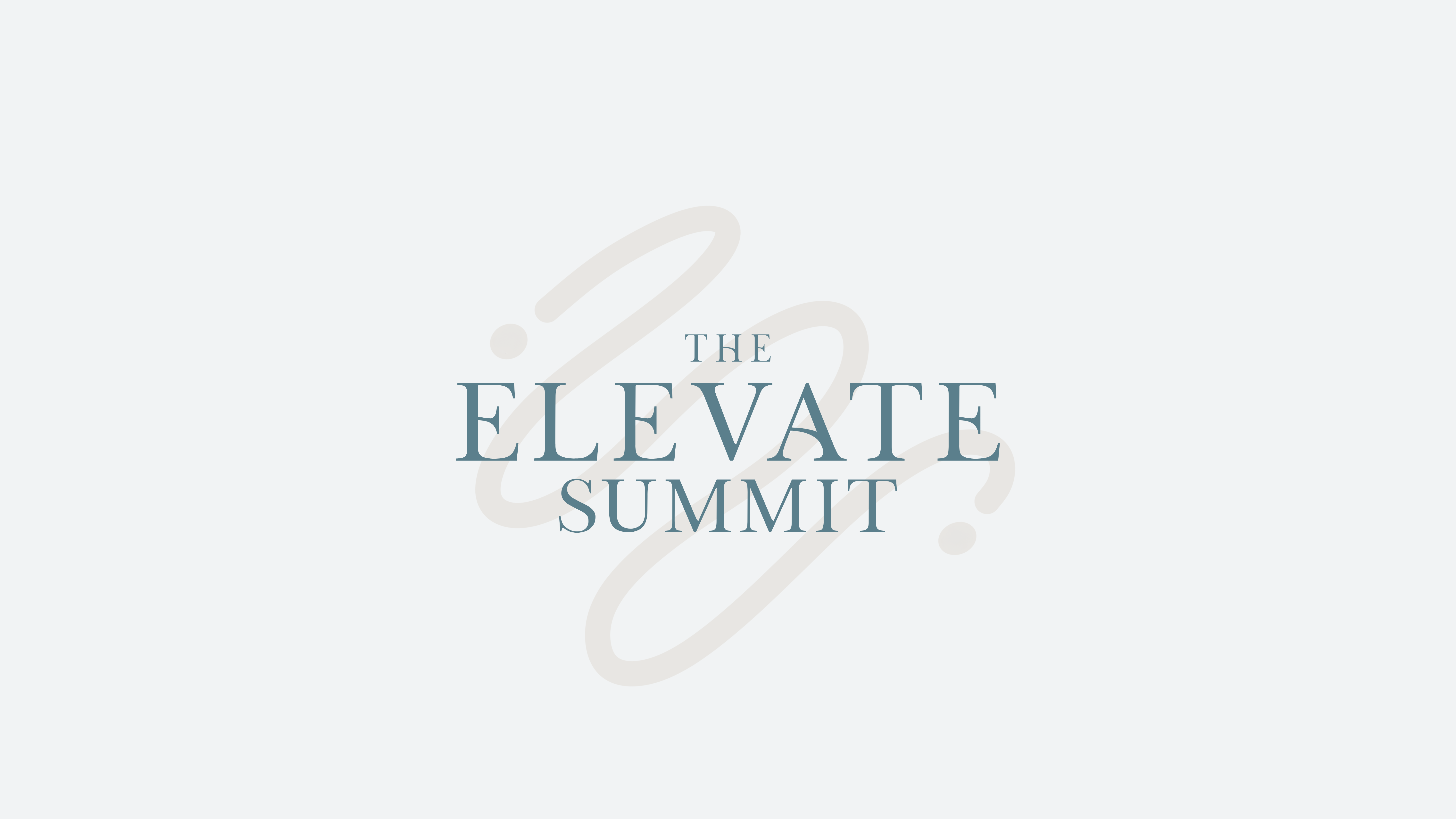
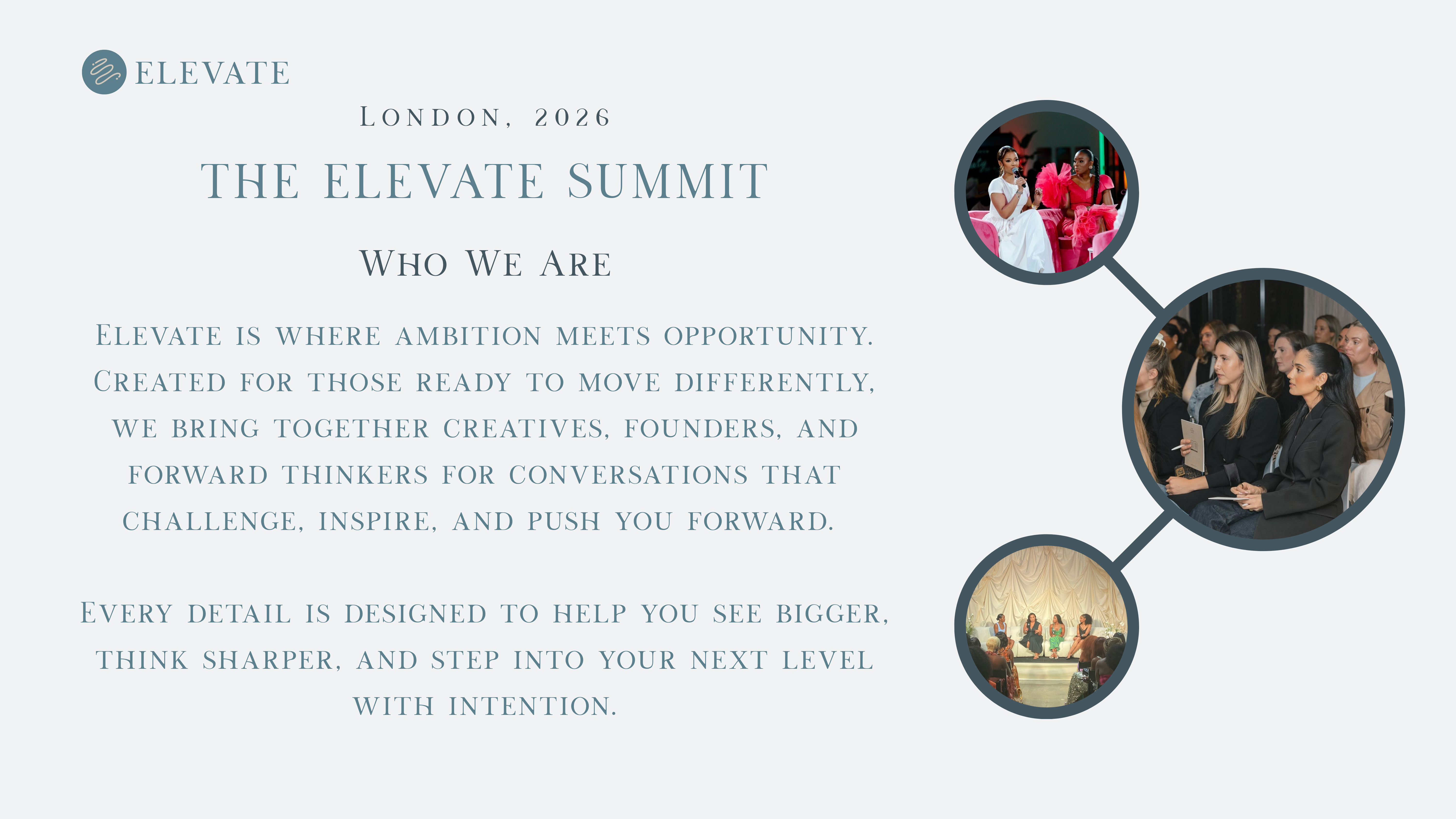
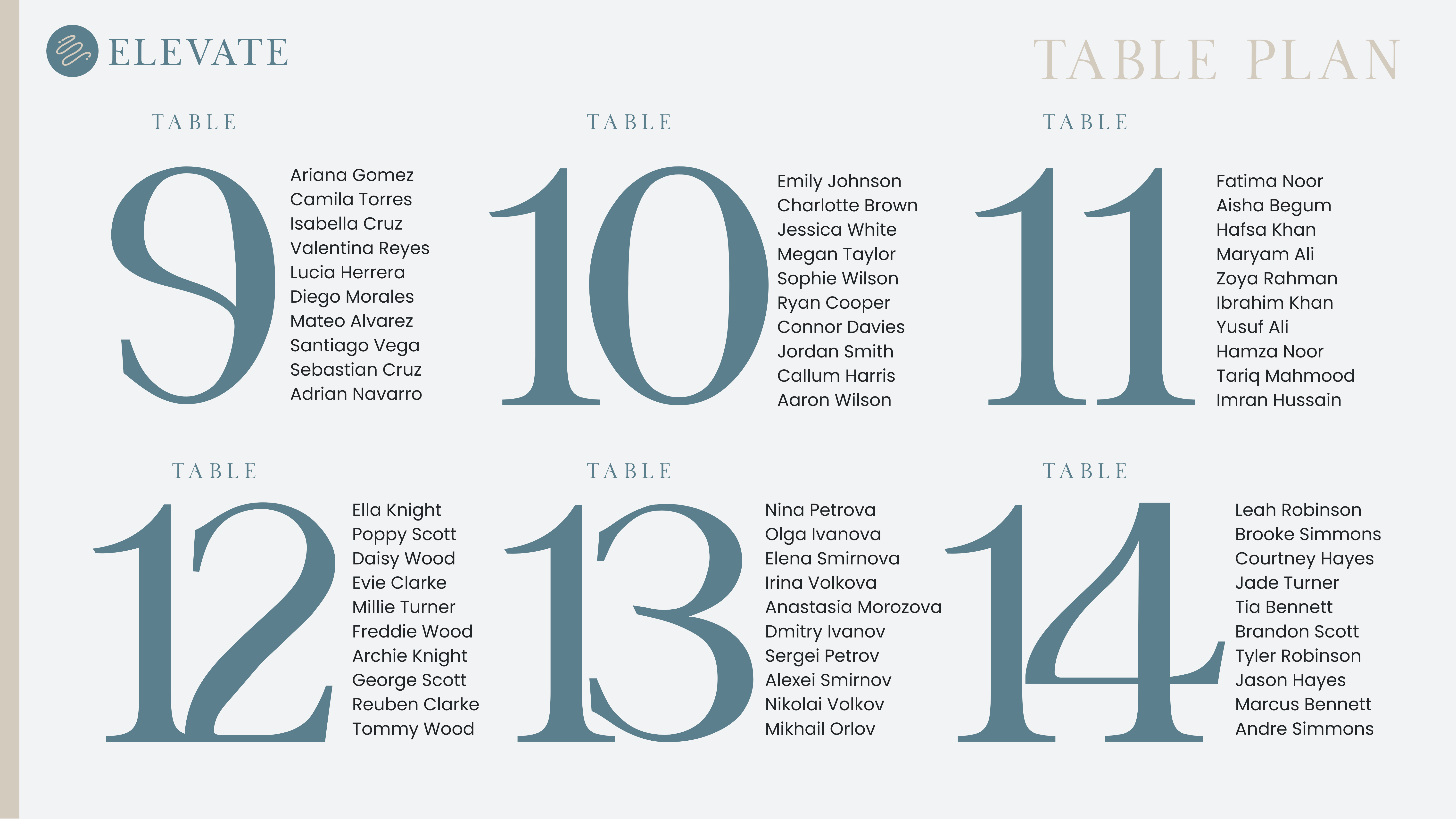
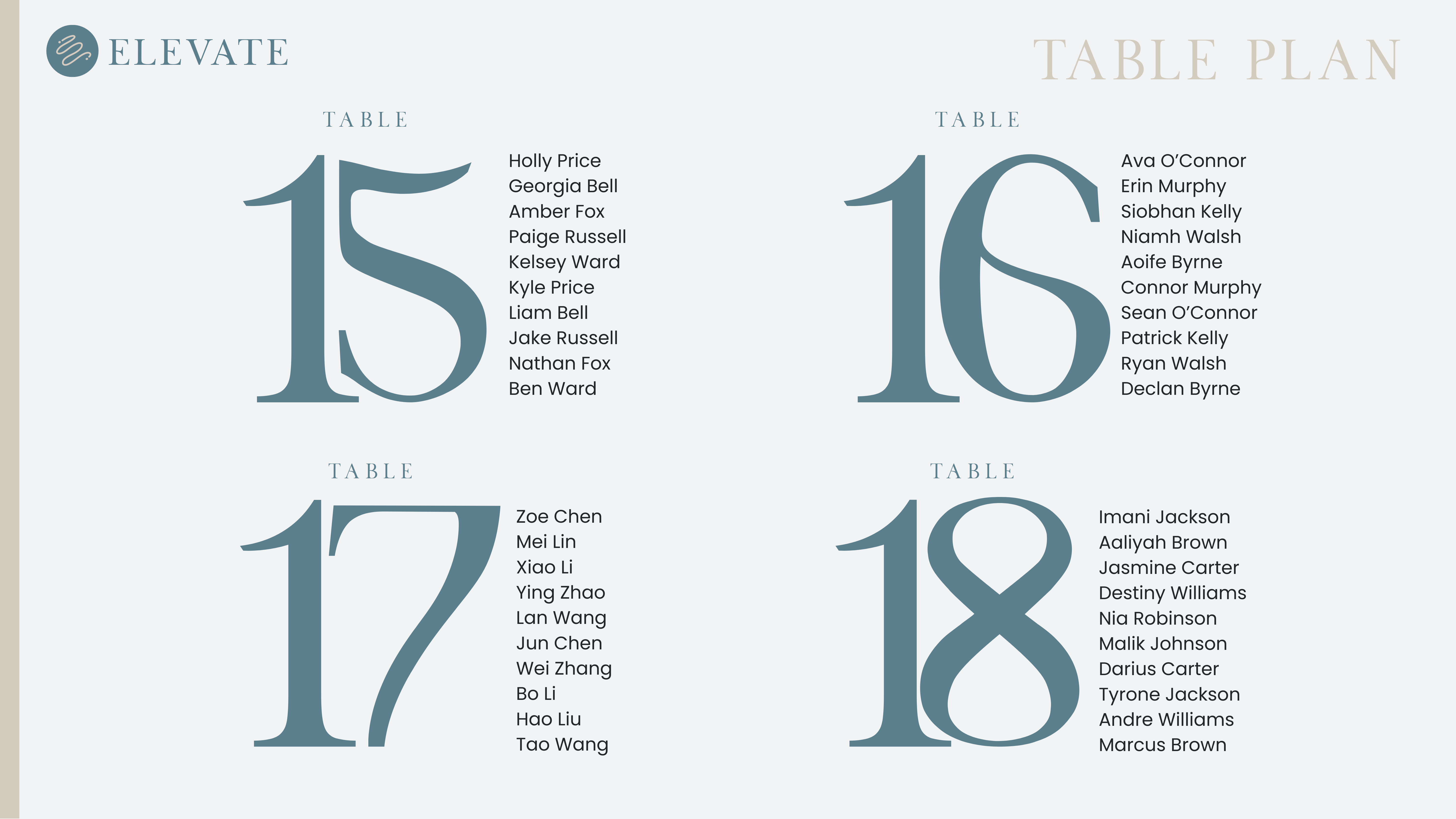
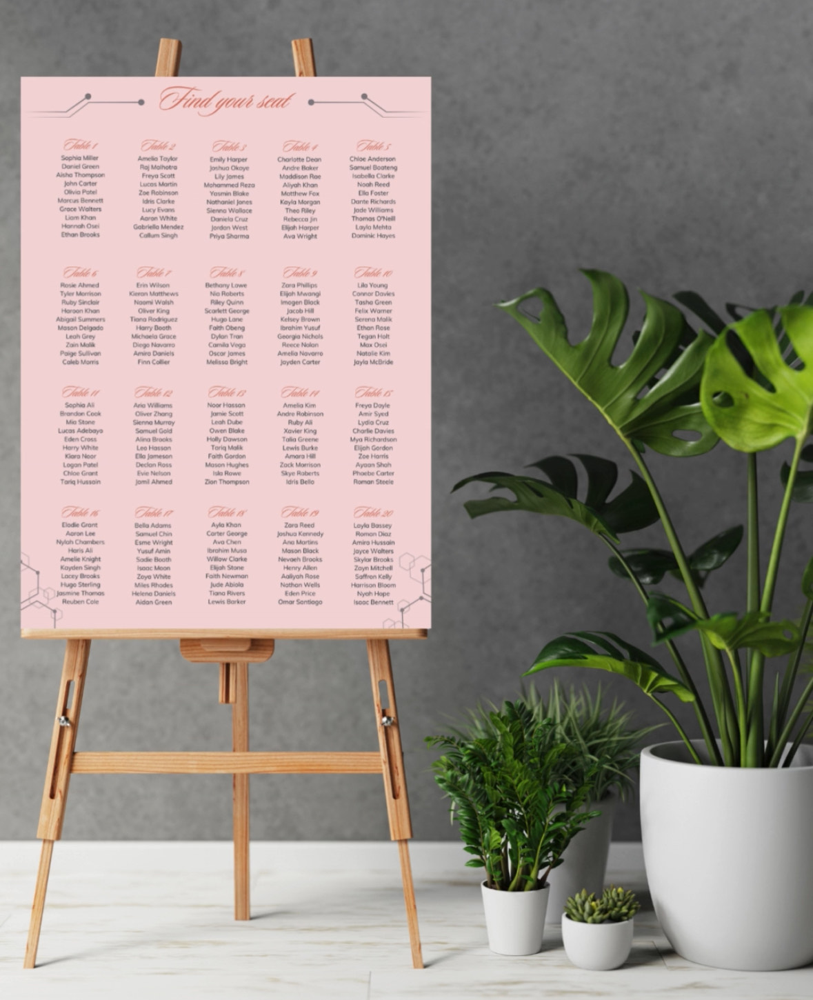
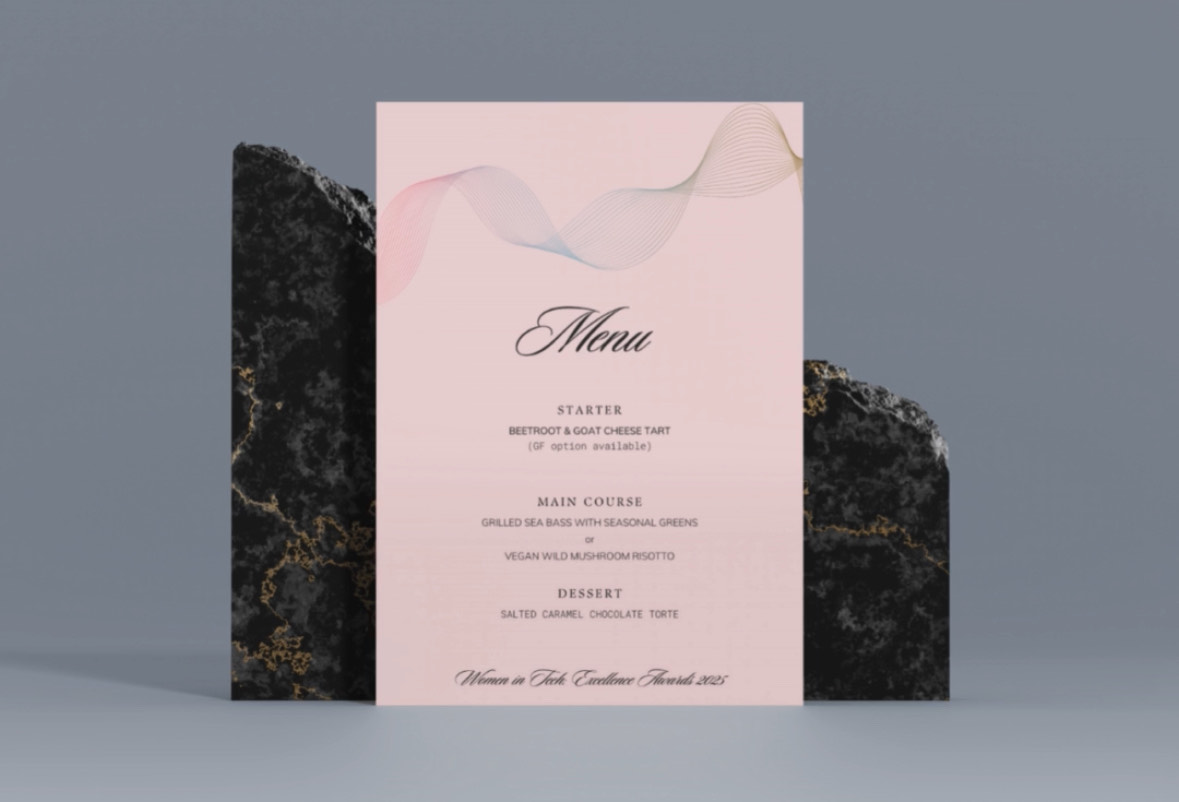
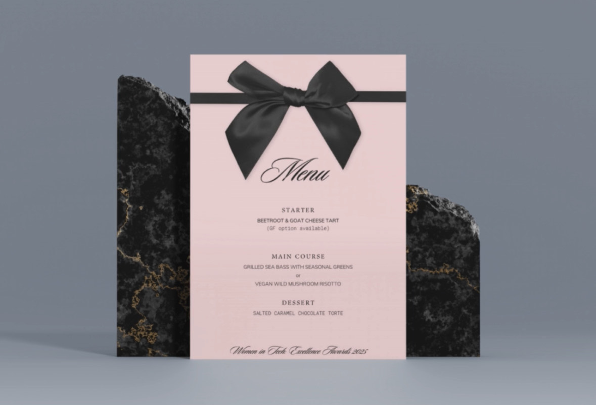
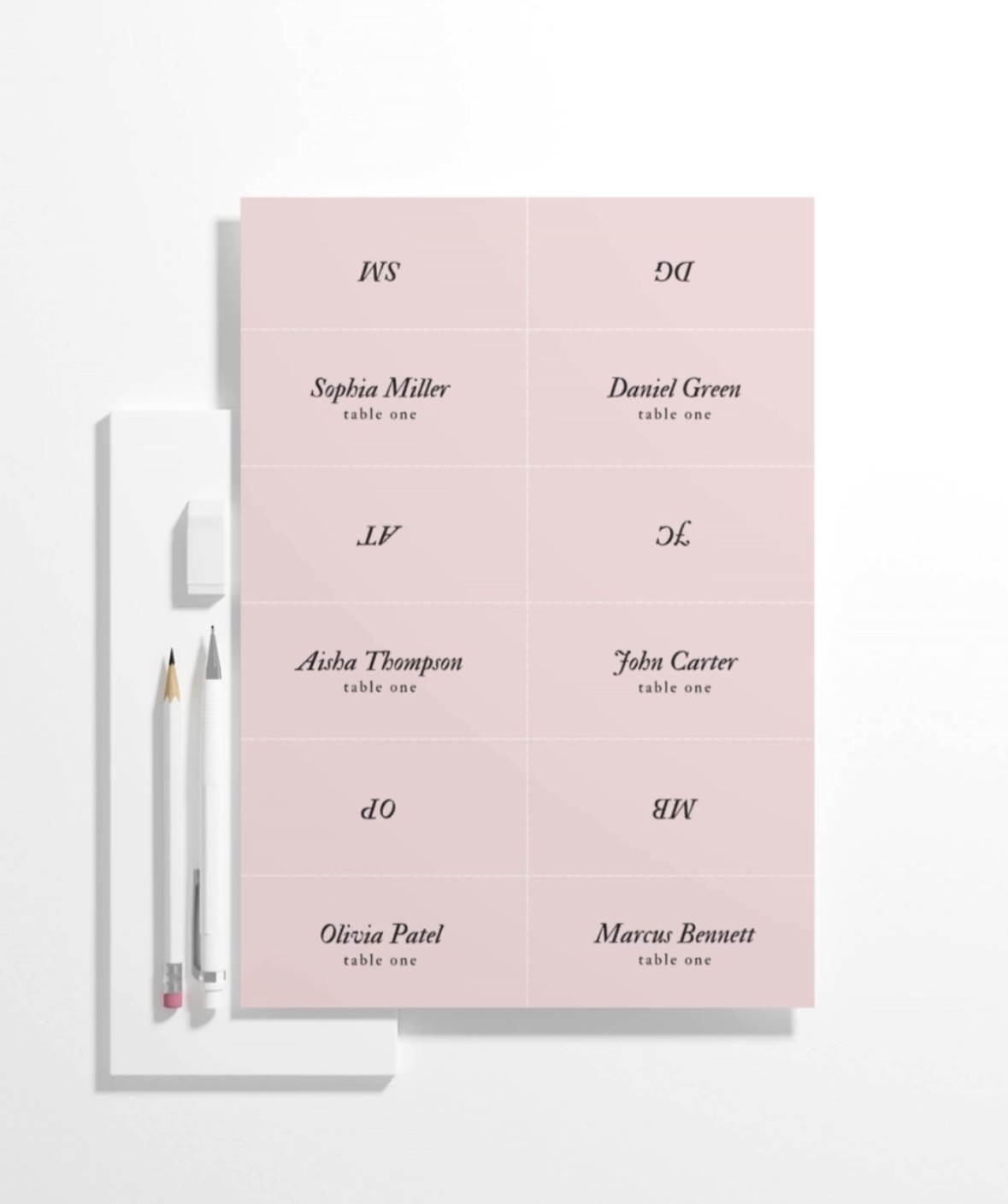
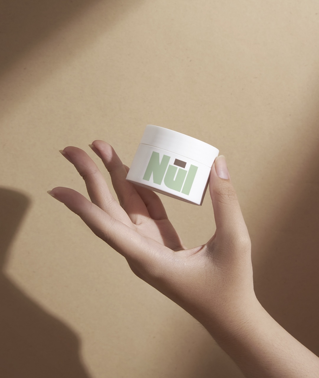
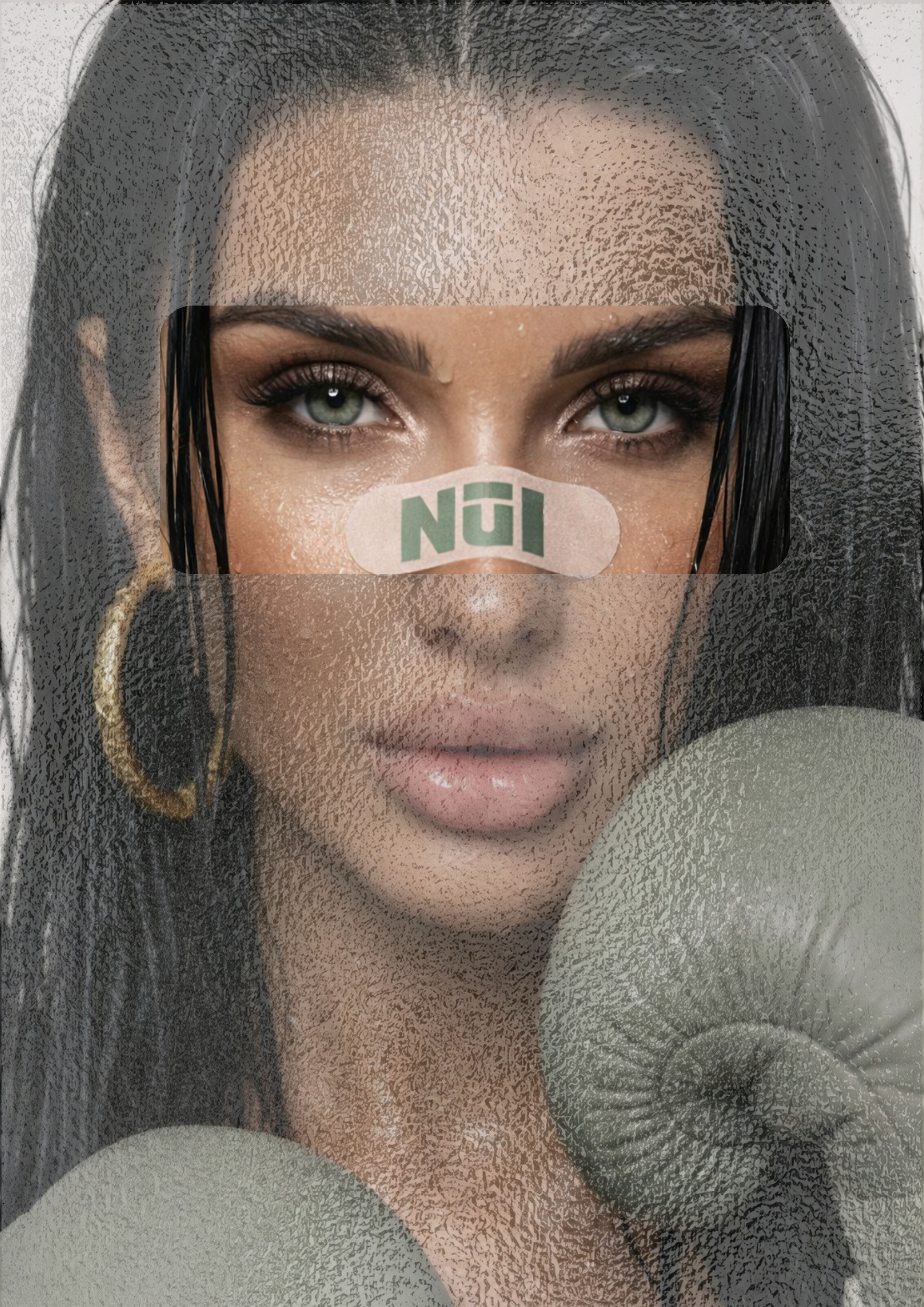
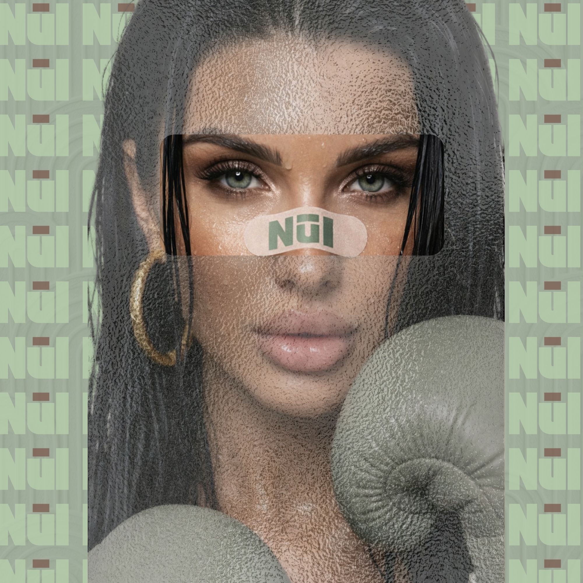
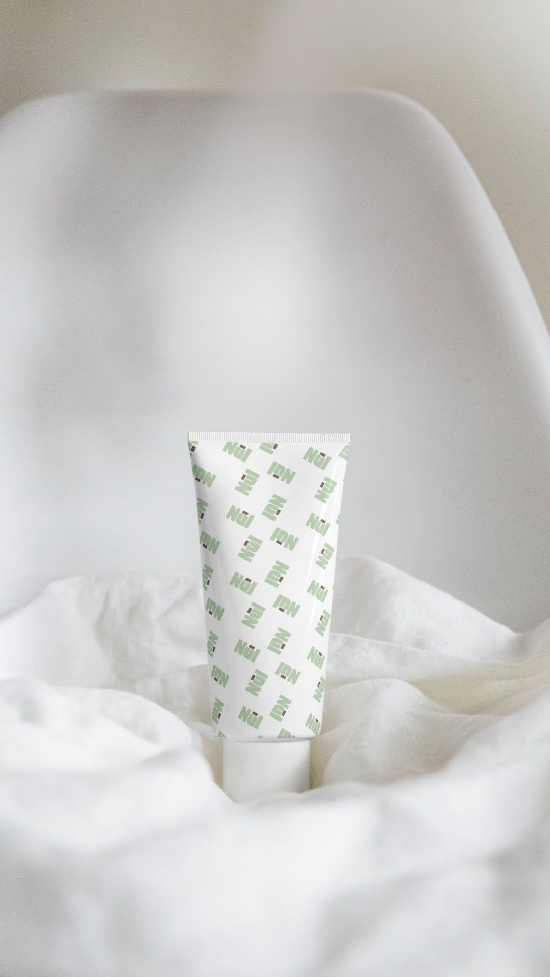
Brand Designer & Visual Creative
Brand identity
& content that
stands out.
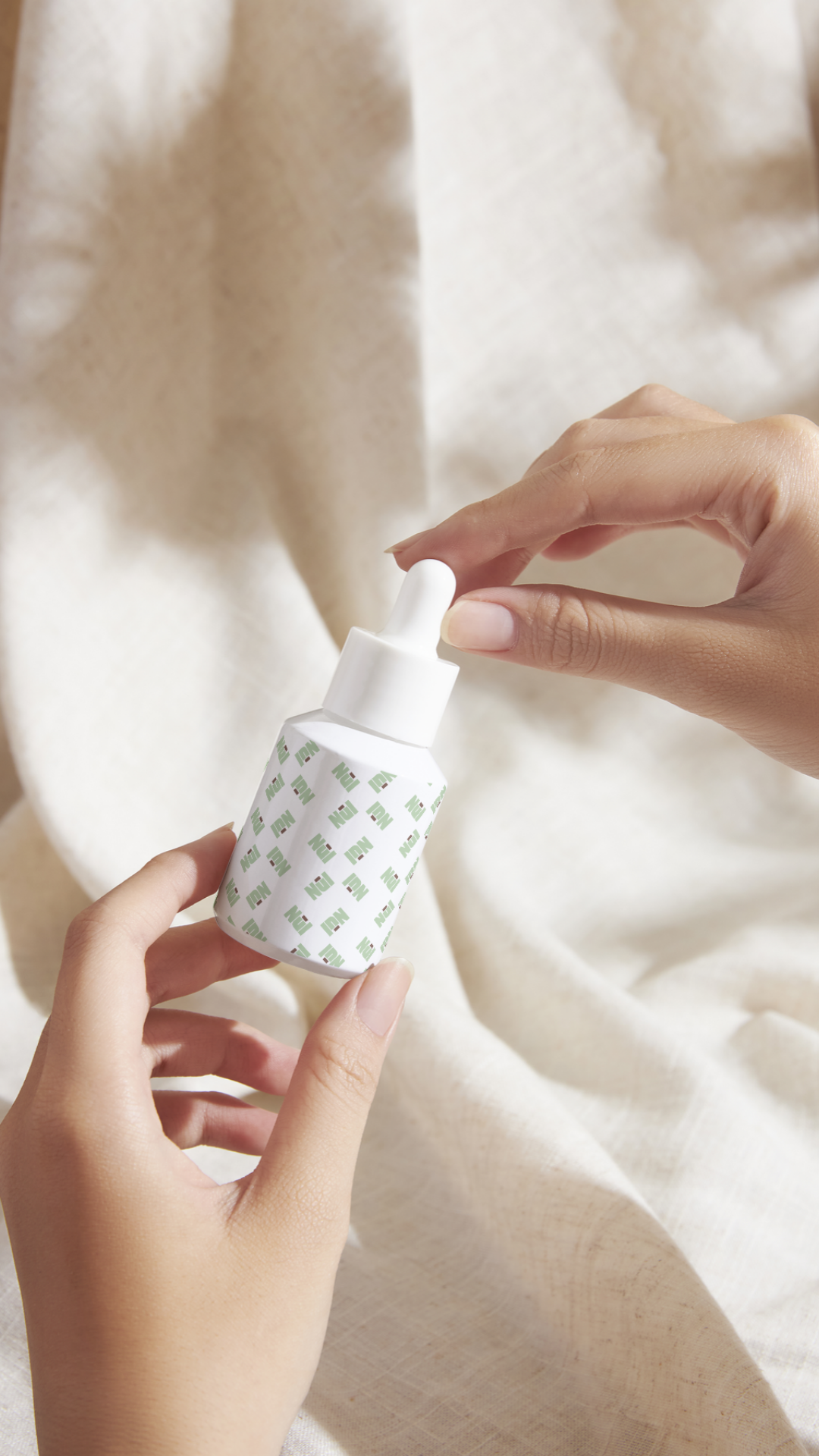
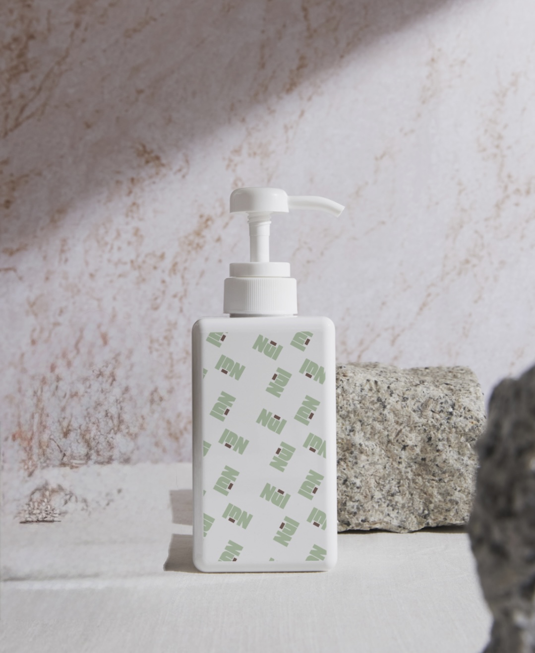
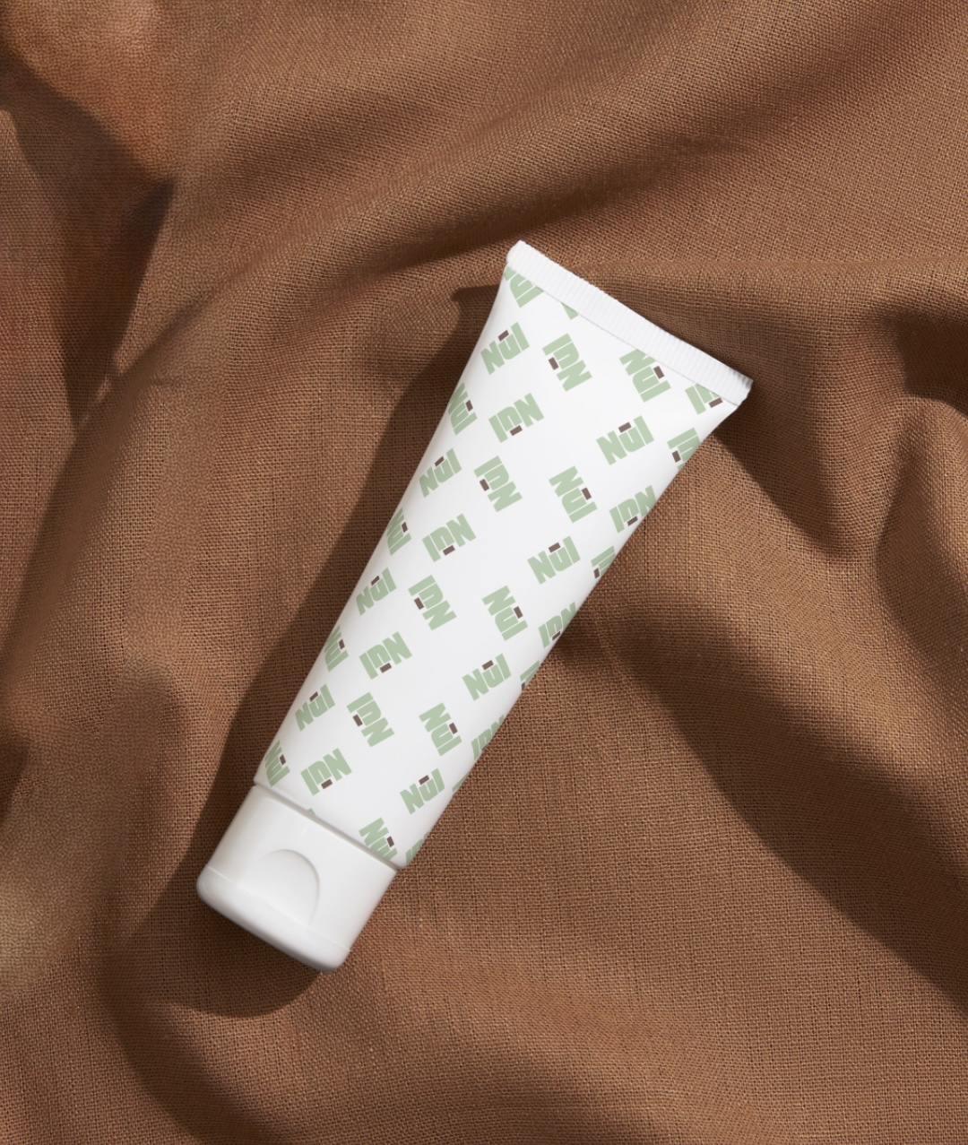
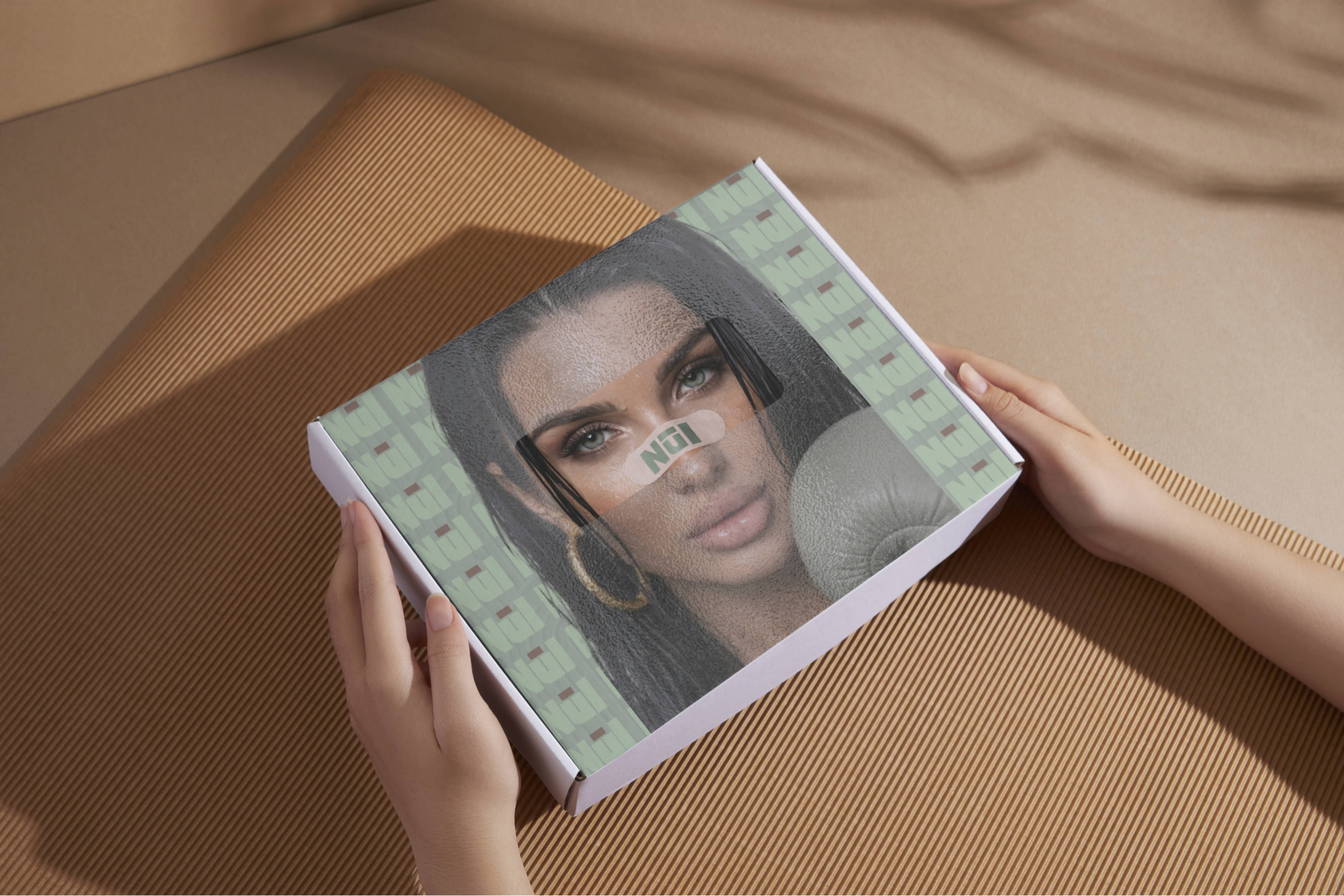
Birmingham based designer specialising in branding, content, and digital visuals, creating work that feels elevated, intentional, and actually connects with people.
View my work →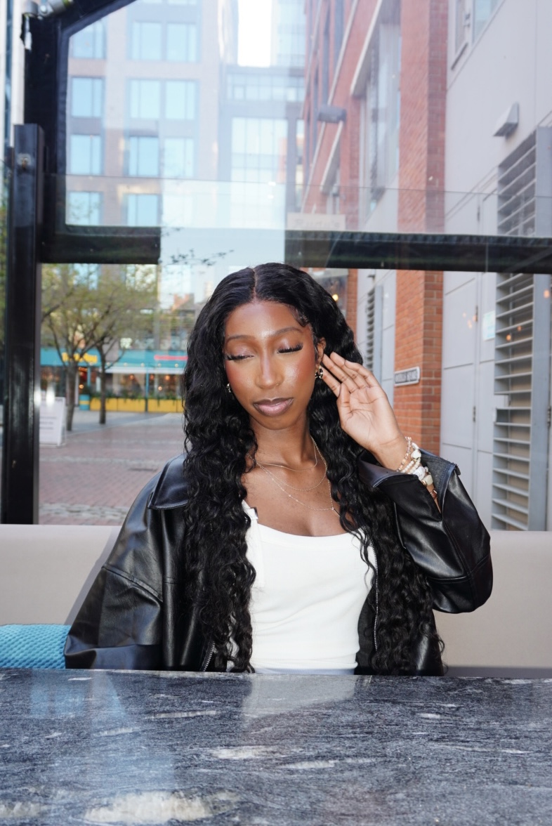 Jasmine Naila, 2026


.PNG)
.png)
.png)


.png)
.png)